
I have always admired people who can teach an important money principle with a simple graph, chart, or drawing. I have been collecting them over the years and thought it was time to share some of my favorites:
The Micawber Principle in Pictures

The simplest interpretation of this drawing is that you are rich, or at least on the path to being rich, when the money you earn is consistently greater than the money you burn. Looking at it this way the drawing is simply a visual representation of The Micawber Principle, the fundamental law of personal finance and namesake of this blog.
The drawing comes from a great YouTube video by Scott Galloway called “The Algebra of Happiness”. In the video Galloway describes the drawing as meaning you are rich when your passive income exceeds your expenditures, which can also be thought of as Financial Independence. While I tend to look at it as representing the Micawber Principle, you might choose to see it as representing Financial Independence. Either way it is a great drawing.
Plan vs Reality

To succeed with money you need a plan, but you also need to realize that things won’t go according to plan. When things are going well you will be taking two steps forward and one back. Other times you might be taking one step forward and two steps back. As illustrated by this great drawing, that’s life. Accept it and enjoy the journey. This drawing has been floating around the internet for years, but I am not sure where it originated or who to give credit to.
Costs Matter

John C. Bogle revolutionized investing for the small individual investor when he introduced the world’s first index fund in 1976. To say the world was skeptical about Bogle’s new invention would be an understatement. The fund got off to a rocky start and was soon labeled “Bogle’s Folley”.
But Bogle never lost faith. When asked later why he was so sure index funds would work he stated emphatically it was because “costs matter”. He had done his research, and he knew that actively managed funds, on average, were underperforming the market by about 2%, which just happened to be almost exactly what the average fund was charging in costs. Bogle reasoned that if he could eliminate most of the costs he could beat most actively managed funds. Time has proved him right.
Bogle likes to talk about the magic of compounding returns and the tyranny of compounding costs. Both increase with time. As the chart above shows investment costs of 2%, over a 40 year period, will consume over half of potential returns. 2% might not sound like much but over an investing lifetime it can cost you several hundred thousand dollars. As Bogle states, “The miracle of compounding returns is overwhelmed by the tyranny of compounding costs.” The lesson: Costs Matter! I recreated the chart above from one in Bogle’s excellent book Common Sense on Mutual Funds.
The Relationship between Risk & Return
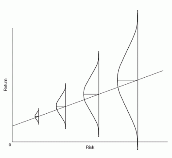
Howard Marks is one of my favorite writers on the subject of risk and return. Marks wrote:
“Especially in good times, far too many people can be overheard saying, ‘Riskier investments provide higher returns. If you want to make more money, the answer is to take more risk.’ But riskier investments absolutely cannot be counted on to deliver higher returns. Why not? It’s simple: if riskier investments reliably produced higher returns, they wouldn’t be riskier.”
Marks also created this excellent graph that illustrates the real relationship between risk and return. As the graph shows, increased potential return is accompanied by increased volatility, both on the upside and downside. The quote and the graph both come from Marks’ superb book, The Most Important Thing: Uncommon Sense for the Thoughtful Investor.
Risk & Return with Actual Data


This series of three charts illustrates the relationship between risk and return, captured elegantly by Marks above, using actual data from 1928 to 2017 for three asset classes: cash, bonds, and the S&P 500. The charts clearly illustrate that the price you pay for higher long-term returns (represented by the red line) is an increasingly wild ride. Taking risk can be rewarding, but it is not for the faint of heart.
The charts come from an article titled Updating Some Performance Charts by Ben Carlson at A Wealth of Common Sense.
Time Decreases Risk

As this chart shows, the relentless march of time acts to smooth out the wild volatility of investment returns. Using history as a guide the expected return of a diversified investment in equities after 50 years would be somewhere between 5 and 8 percent, and after just five years the risk of losing money is close to zero. I recreated this graph from one in John C. Bogle’s great book Common Sense on Mutual Funds.
The Rest of the Story

I used to love listening to Paul Harvey’s radio broadcasts of “The Rest of the Story”, in which he tells a great story but doesn’t reveal who it is about until the end. Mike Rowe has a current podcast called “The Way I Heard It” that is similar, and also excellent. The Bogle chart above showing how time narrows the range of probable investment returns is absolutely true, but it only tells half the story. Carl Richards tells “the rest of the story” with one of his simple but profound drawings.
The left side of Richard’s drawing is similar to Bogle’s graph, showing how the possible range of investing outcomes, as measured in percentage points, narrows over time. The right side of the drawing reminds us that over an investing lifetime two or three percentage points can mean hundreds of thousands of dollars.
Even as the possible outcomes measured in return percentage decreases, the possible outcomes measured in dollars increases. This is vital to remember since we spend dollars, not percentage points. The lesson is that, since investing deals with the future, there will always be risk and uncertainty. This highlights the need to be flexible and always have a plan B. You can find Richard’s drawings at his website: behaviorgap.com
Investment Performance Quilt

This fantastic chart by Ben Carlson at A Wealth of Common Sense ranks investment returns from highest to lowest for ten different asset classes over the last decade. Carlson updates this chart each year. The first thing you should notice is how the top performers change from year to year. As such, it is a great visual reminder of how essential it is to diversify. While you don’t need to be invested in all of these asset classes you probably should be invested in at least 3-4 of them. Carlson wrote about this chart in an article on his blog called Updating My Favorite Performance Chart for 2017.
Behavior is More Important than Knowledge

I am a firm believer that when it comes to investing, behavior is far more important than knowledge. This drawing by Carl Richards illustrates this brilliantly.
If you let human nature take over you will be broke before you know it, but if you can control your emotions your financial future is bright. As Brendan Moynihan stated, “Emotions are neither good nor bad; they simply are. They cannot be avoided. But emotionalism (i.e., decision making based on emotions) is bad, can be controlled, and should be avoided.”
One of the reasons I love index funds so much is because, by freeing me from the illusion that I can predict the future, they allow me to put all my focus into controlling my behavior, and by controlling my behavior I can be a successful investor.
1 comment for “9 Enlightening Money Graphs, Charts, and Drawings”